THE BODRUM EDITION
YEAR
2025
TOOLS
Photoshop | Lightroom | InDesign
BIO
Natural light, real moments.
Shot at Les Benjamins’ Bodrum pop-up, this series captures the summer collection through a spontaneous and natural approach. The final images were refined using Lightroom and Photoshop while keeping the look authentic and effortless.
THE BODRUM EDITION
YEAR
2022
2025
TOOLS
Illustrator
Photoshop
Lightroom
Premiere
InDesign
BIO
Translating an Artist’s Language into Poster Design.
Created for a documentary about Burhan Doğançay, one of Turkey’s most celebrated contemporary artists, this poster was developed as a visual extension of his distinctive artistic world.

THE BODRUM EDITION
YEAR
2022
2025
TOOLS
Illustrator | Photoshop
Lightroom | Premiere
InDesign
BIO
Translating an Artist’s Language into Poster Design.
Created for a documentary about Burhan Doğançay, one of Turkey’s most celebrated contemporary artists, this poster was developed as a visual extension of his distinctive artistic world.
At The Bodrum EDITION, I developed creative solutions across branding, hospitality, events, and food and beverage. This page presents a selection of projects that reflects my role, approach, and contribution to the hotel’s visual identity.
The challenge was not simply to launch the season with impact. It was to maintain that same level of energy, precision and consistency every day that followed.
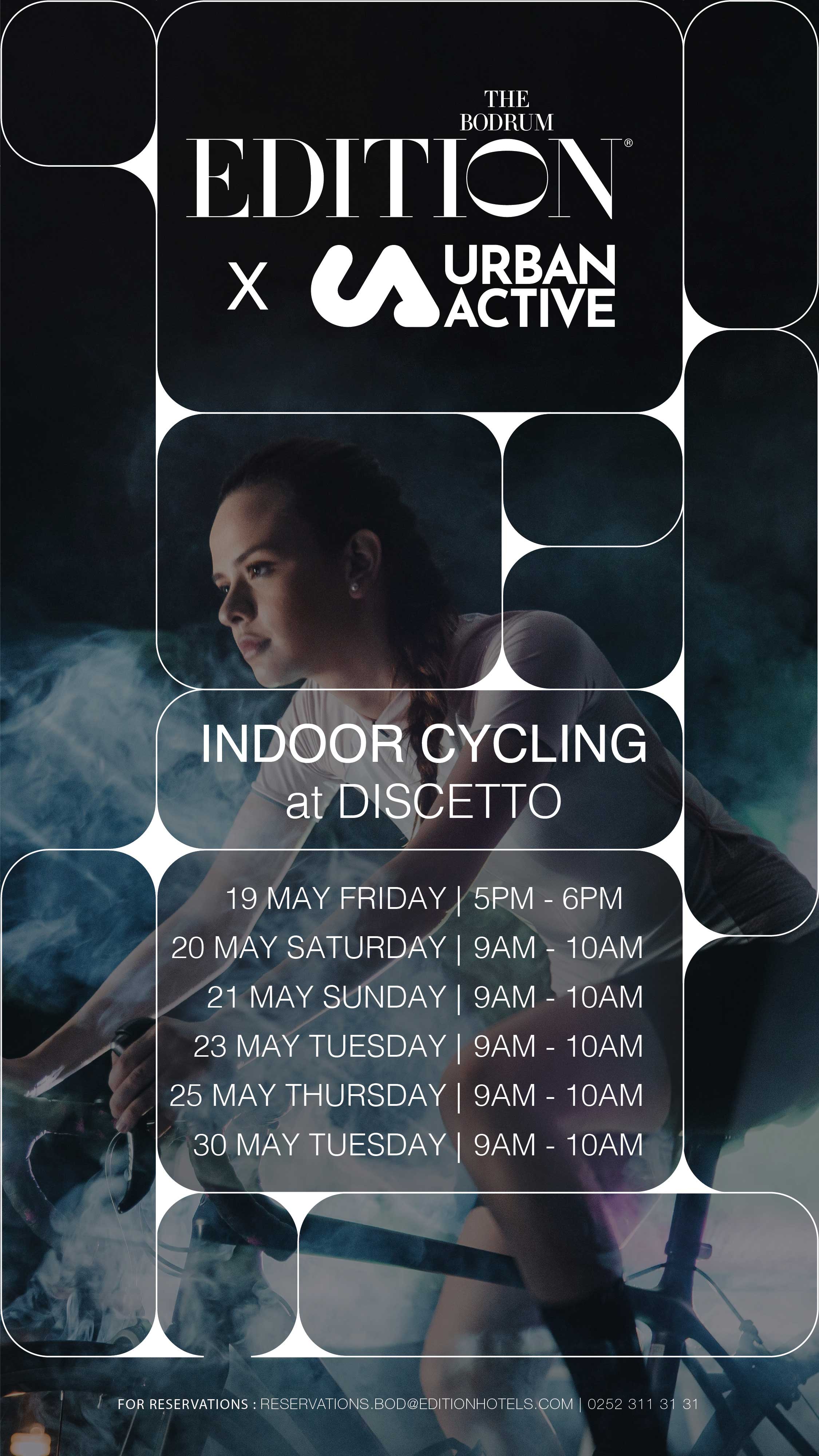
Events at The Bodrum EDITION were conceived as high-impact cultural moments, bringing together internationally recognised DJs, artists, and media partners including GQ and Cosmopolitan.
My role was to define the visual language behind each activation and translate its identity across every touchpoint. From the initial creative direction to the final rollout, I developed design systems that could perform across campaigns, social content, print, signage, invitations, and the physical guest experience.
The challenge was never simply to make an event look good. It was to create a distinct visual world, build anticipation, control consistency, and ensure that every execution carried the same level of energy, relevance, and precision expected from the EDITION brand.
At The Bodrum EDITION, I developed creative solutions across branding, hospitality, events, and food and beverage. This page presents a selection of projects that reflects my role, approach, and contribution to the hotel’s visual identity.
The challenge was not simply to launch the season with impact. It was to maintain that same level of energy, precision and consistency every day that followed.
Events at The Bodrum EDITION were conceived as high-impact cultural moments, bringing together internationally recognised DJs, artists, and media partners including GQ and Cosmopolitan.
My role was to define the visual language behind each activation and translate its identity across every touchpoint. From the initial creative direction to the final rollout, I developed design systems that could perform across campaigns, social content, print, signage, invitations, and the physical guest experience.
The challenge was never simply to make an event look good. It was to create a distinct visual world, build anticipation, control consistency, and ensure that every execution carried the same level of energy, relevance, and precision expected from the EDITION brand.
Created for a documentary on Burhan Doğançay, this poster began with immersion. I watched the film before its release to understand his world, his rhythm and the visual language that made his work instantly recognisable.
Doğançay transformed urban walls, torn posters and everyday traces into layered compositions full of movement. I translated that energy through ripped paper, overlapping forms and raw textures—testing multiple collage directions before refining the final structure.
The red background became the anchor: bold, intense and directly connected to his work. The result is not a reproduction of his style, but a visual response to it, a poster built to carry the same tension, depth and impact.
Just below, you can see the project’s evolution; from my first concept, built around raw torn-paper experimentation, to the final poster, where the composition was refined, balanced and given a stronger visual impact.




Food and beverage at The Bodrum EDITION carried the same level of ambition as the hotel itself.
Working across restaurants led by Michelin-recognised chefs, I created visual identities, menus, campaigns and event materials that reflected the personality of each concept while respecting the wider EDITION brand.
BRAVA by Stefano Ciotti, KITCHEN by Osman Sezener, Inari Munira and the hotel’s other dining destinations all required a different visual approach.
Some called for a more refined editorial language. Others needed something warmer, more expressive or more experiential.
My role was to understand those differences and translate them into design systems that felt distinctive, functional and consistent across print, digital and physical guest touchpoints.
Food and beverage at The Bodrum EDITION carried the same level of ambition as the hotel itself.
Working across restaurants led by Michelin-recognised chefs, I created visual identities, menus, campaigns and event materials that reflected the personality of each concept while respecting the wider EDITION brand.
BRAVA by Stefano Ciotti, KITCHEN by Osman Sezener, Inari Munira and the hotel’s other dining destinations all required a different visual approach.
Some called for a more refined editorial language. Others needed something warmer, more expressive or more experiential.
My role was to understand those differences and translate them into design systems that felt distinctive, functional and consistent across print, digital and physical guest touchpoints.
Created for a documentary on Burhan Doğançay, this poster began with immersion. I watched the film before its release to understand his world, his rhythm and the visual language that made his work instantly recognisable.
Doğançay transformed urban walls, torn posters and everyday traces into layered compositions full of movement. I translated that energy through ripped paper, overlapping forms and raw textures—testing multiple collage directions before refining the final structure.
The red background became the anchor: bold, intense and directly connected to his work. The result is not a reproduction of his style, but a visual response to it, a poster built to carry the same tension, depth and impact.
Just below, you can see the project’s evolution; from my first concept, built around raw torn-paper experimentation, to the final poster, where the composition was refined, balanced and given a stronger visual impact.


I evolved this signature element of the hotel by creating a distinct visual identity for each flavour.
I evolved this signature element of the hotel by creating a distinct visual identity for each flavour.
I evolved this signature element of the hotel by creating a distinct visual identity for each flavour.

I created the visual identity for Swallow’s Nest, the hotel’s rosé developed with a local vineyard as part of a sustainable collaboration.
I created the visual identity for Swallow’s Nest, the hotel’s rosé developed with a local vineyard as part of a sustainable collaboration.
I created the visual identity for Swallow’s Nest, the hotel’s rosé developed with a local vineyard as part
of a sustainable collaboration.
I Created with a mixologist and children’s book illustrator, this cocktail menu reimagines each drink as
a Pinocchio character, bringing an authentic storybook feel to the hotel’s Michelin-starred Italian restaurant.
I Created with a mixologist and children’s book illustrator, this cocktail menu reimagines each drink as
a Pinocchio character, bringing an authentic storybook feel to the hotel’s Michelin-starred Italian restaurant.
I Created with a mixologist and children’s book illustrator, this cocktail menu reimagines each drink as
a Pinocchio character, bringing an authentic storybook feel to the hotel’s Michelin-starred Italian restaurant.


other works
other works
